MASTERMIND WINE
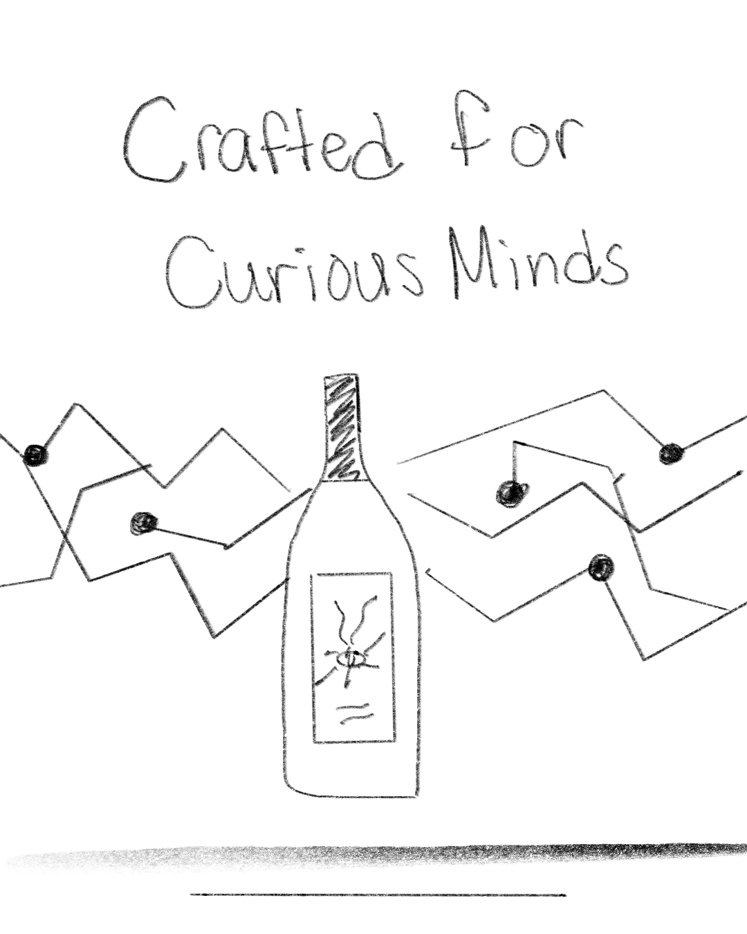
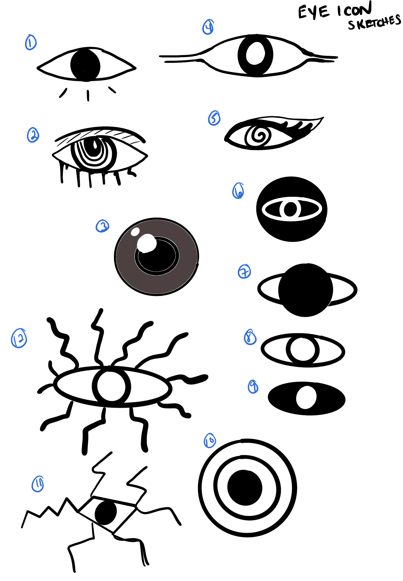
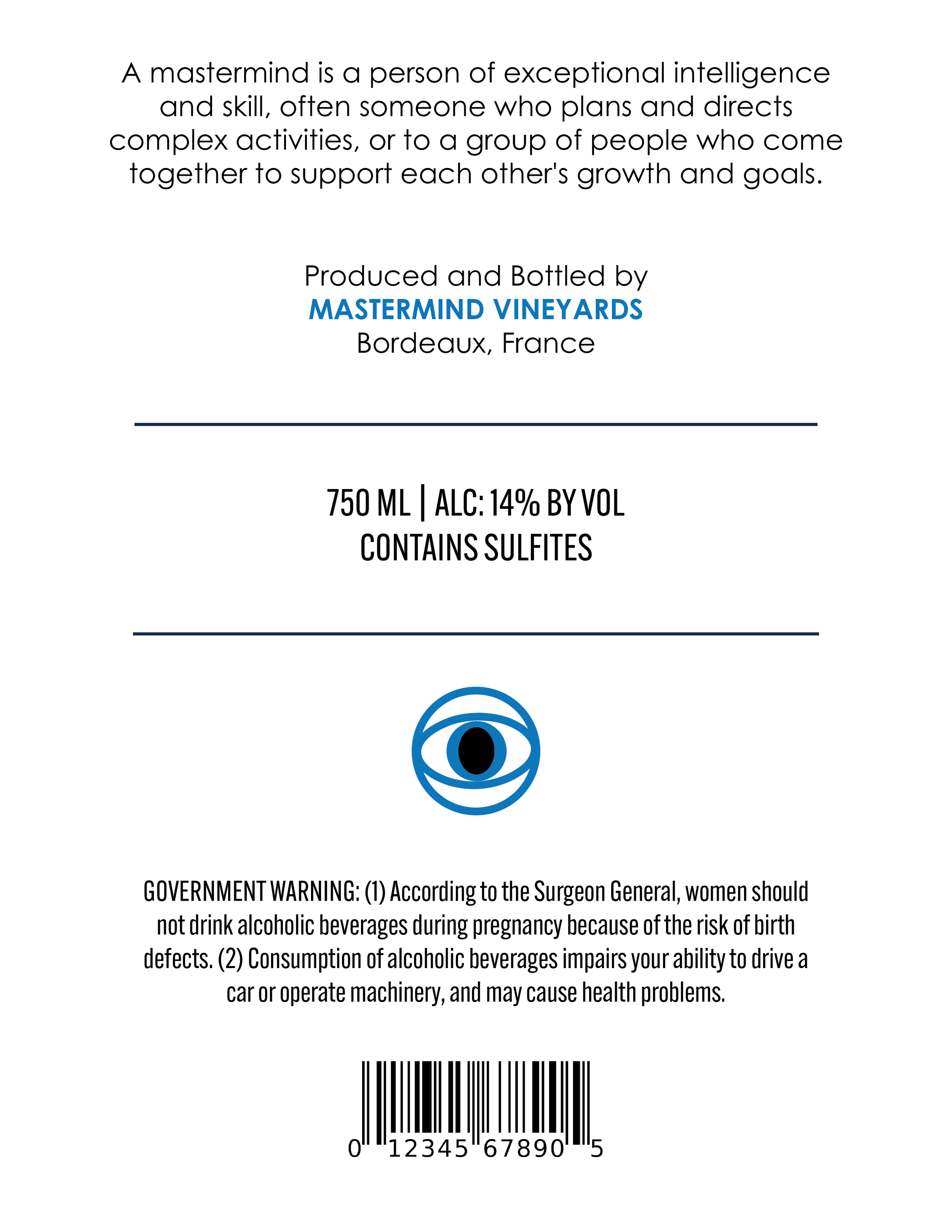
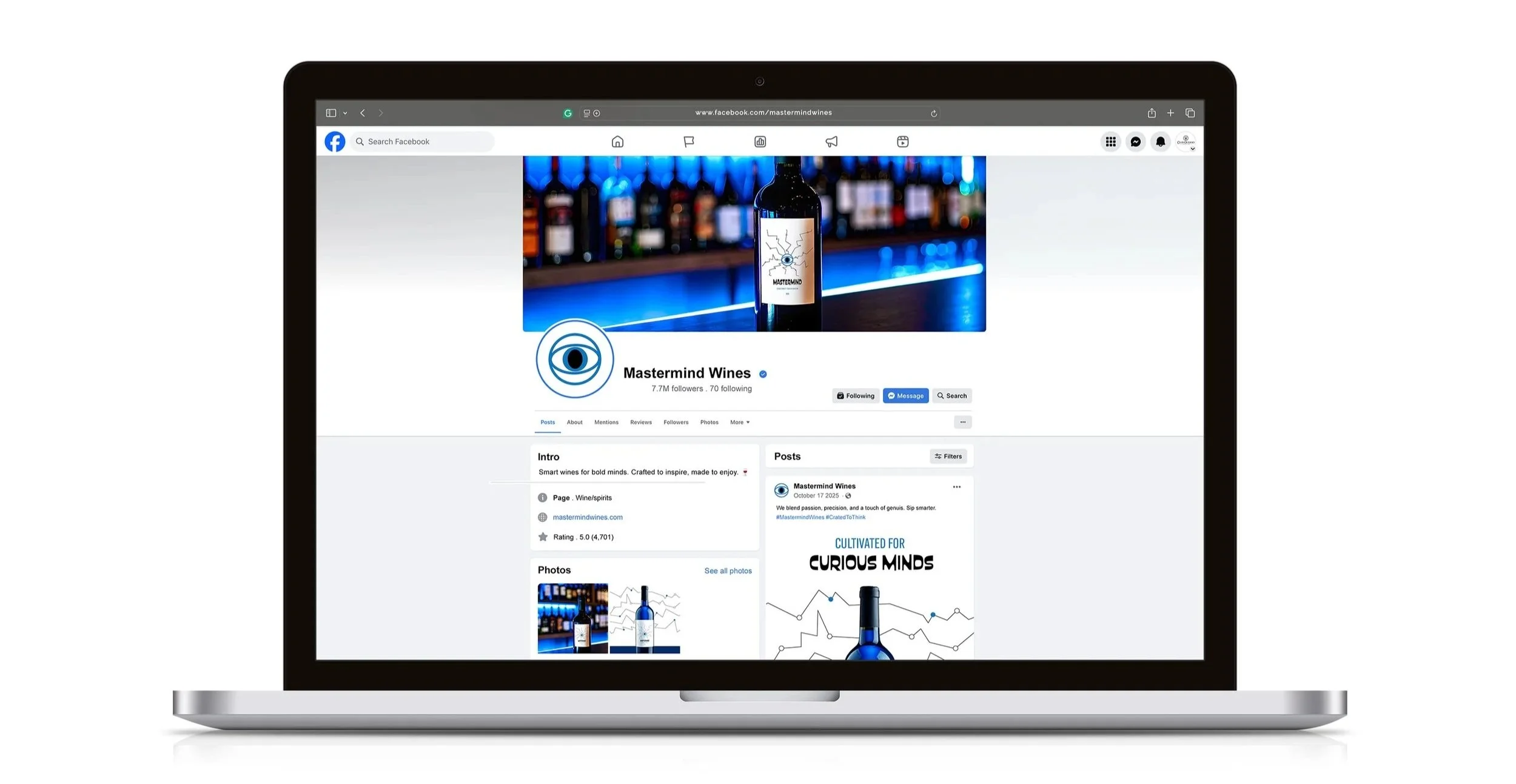
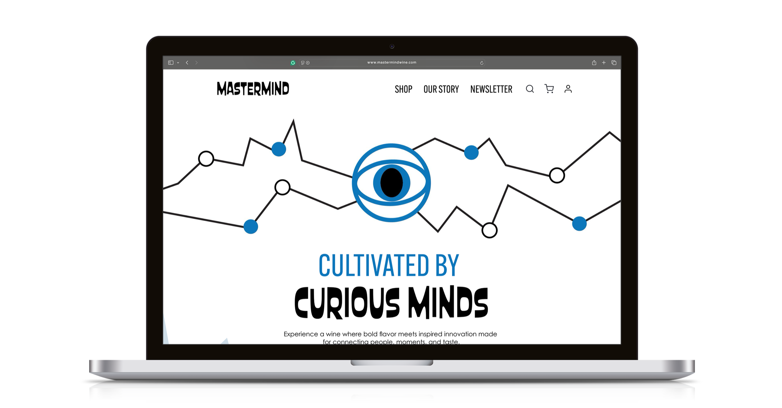
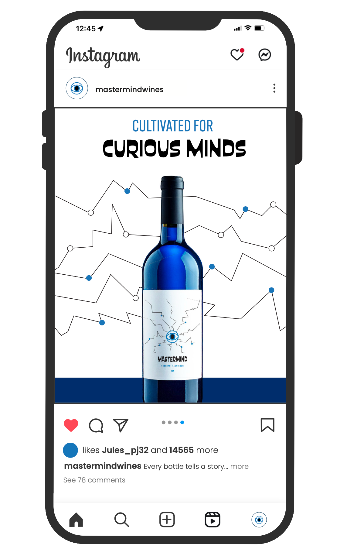
The challenge was to develop a wine brand that appeals to younger audiences—Millennials and Gen Z—who prioritize individuality, intellect, and creativity over tradition. Many wine labels seem outdated or unrelatable, creating a need for a concept that feels modern, bold, and empowering. The design solution redefines what it means to be a “mastermind.” Using abstract geometry, a clean sans serif typeface, and a cool, cyberpunk-inspired color palette, the design represents focus and innovation. The eye-catching geometric graphic and sleek layout draw attention, while the narrative inspires consumers to see themselves as visionaries in control of their craft.
